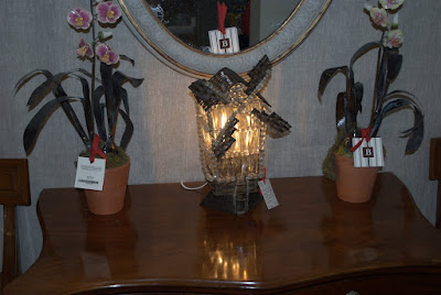
In the meantime....it has finally begun to feel like spring again in Chicago which is making me think about sitting outside on a hot summer night sipping cocktails with great friends. Here is a picture of inspiration for you to enjoy. Have a fabulous weekend!
Thursday, April 29, 2010
Thinking of Summer
I'm off for a lovely much needed long weekend up at my parents farm. Unfortunately I will be missing the Antique Fair at the Merchandise Mart in Chicago but I will be reupholstering and painting a chair my parents are so kindly giving to me. Hopefully some before and after shots of that coming up.
In the meantime....it has finally begun to feel like spring again in Chicago which is making me think about sitting outside on a hot summer night sipping cocktails with great friends. Here is a picture of inspiration for you to enjoy. Have a fabulous weekend!
Tuesday, April 27, 2010
Nature Inspired
One of my crazy dreams has always been to live on a big horse farm and have all kinds of animals and be out in the middle of nowhere. However, I am also a girl who loves to shop, so being out in the middle of nowhere might not quite work. So living in the city I am. But that doesn't mean I can't surround myself with nature! I am loving all the nature inspired decor that is very popular right now. Take a look at the images below for some new things for your own home.
This is from my own apartment. The tree branches and birds are actually just a simple to put up wall decal! You can order from http://www.modernwallgraphics.com/ . The image on the right are my curtains from Ikea, but alas they have been discontinued.
This plate just makes me smile. This one and more designs are available at http://www.anthropologie.com/.
The bee glasses are on my wish list! I just love these! Just a little subtle nature inspiration here. Check them out at www.worldmarket.com.
Gorgeous wallpaper, again from http://www.anthropologie.com/. Some day when I have a house I am going to put up some great wallpaper. There are so many modern designs out today that I love.
I may have mentioned my obsession with owls lately. I could have put up 20 different owl products but refrained and put just the one that's at the top of my wish list. Both of these adorable book ends are available at http://www.barnesandnoble.com/.
I die for this caribou head made out of resin. It is available through http://www.ateliierabigailahern.com/. This one may be on my wish list for a very long time as it's a rather expensive one.
I bought this sly fox doorknocker without even having a place to put him I loved it so much. Also available at Anthropologie.
Sunday, April 25, 2010
Pottery Barn Floral Arranging Class
This Sunday I attended the Pottery Barn decorating class on the Art of Botanical Arranging. Pottery Barn is one of my all time favorite stores for great home decor accessories and beautiful very real looking faux flowers. They also have great decorating classes every month. Some of my favorites are when they have classes on setting tablescapes for all the holidays. Here I learned some great ideas for real or faux flower arranging and using items from Pottery Barn or perhaps things you have in your own home or backyard.
The first idea was on arranging large stems or branches in a large vase. They recommended using an odd number of branches because it ends up looking better visually. You can criss-cross the branches into the vase and keep adding until it looks full enough. Also with the faux flowers you can bend and move the branches to help them to have more depth.
Here is a mid-sized vase and flowers. This arrangement works best in a cylindrical vase rather than square. With square vases you always need a larger grouping of flowers to fill in the vase.
You may not be able to see what this is clearly but they gave the suggestion of using a pop bottle with the top cut off and placing it inside the square vase in order to hold the flowers together better. I love this idea! It is inexpensive and easy.
They also suggested taking floral tape or even scotch tape if that's all you have at home and making a grid with the tape at the top of the vase to hold each flower in place. This is such a great idea if you get home with a bunch of flowers but they just don't fill out the vase well.
These hydrangeas are one of my favorites. They fit really well into square vases since they're such a full flower. The faux flower stems needed to be bent in these vases, which doesn't look very good, so you can add a fun vase filler. Here, on the left, they used faux limes and moss and it looked beautiful.
Other vase fillers suggestions were to find something at a local market to fill in the bottom of the vase.
Here they used a large leaf to wrap around the stems of these flowers in the bottom of the vase.
This is one of Pottery Barn's new lanterns with large branches. You could use real branches here again by using a large soda bottle with the top cut off and filled with water placed inside the lantern.
This arrangement has some larger flowers in the center and the tallest part of the arrangement, then going down and out from there are the smaller purple flowers. You start with the tallest in the middle and work down from there.
They also recommended finding different things around your home to use as vases like pitchers, creamers, shot glasses, etc. You could use shot glasses, creamers, tiny bud vases for place cards at a table.
Here they have even used a coffee cup with some faux and some real flowers. You can use just greenery which is really pretty on it's own as well.
If you ever get a chance to check out a Pottery Barn decorating class I would recommend it! You get a 10% discount on anything you buy that day as well. You can find the next class in your area by checking out www.potterybarn.com.
Wednesday, April 21, 2010
Wednesday Inspiration
I wanted to share with you this modern country room for some inspiration today! I especially love the picture of the horses. Hope you're enjoying your Wednesday.
*Image courtesy of Elle Decor
Labels:
interior decor,
interior design,
modern country
Tuesday, April 20, 2010
Antique and Garden Show
This past Sunday I went to the Antique and Garden Show at the Chicago Botanic Garden and realized that gardens and antiques make me so happy! If you get a chance to go to an antique show, even if you think it's not your style, you may be pleasantly surprised.
Daffodils and tulips were in full bloom and just beautiful.
It reminded me of Holland, Michigan's Tulip Time!
They said in a couple of weeks the lilacs will be blooming, which are my absolute favorite flower. I will be back then for sure.
Who knew they'd have adorable clothes at an antique show.
Seeing I am a 100% dutch girl from Holland, Michigan I adore this little windmill lamp.
This space was Scarlett Scales Antiques and I was so inspired by their set up and gorgeous antiques. I was kind of bummed to find out later they are actually located in Tennessee because I'd love to go back and see more! You can check out their website at www.scarlettscales.com. It will not disappoint.
If you click on this picture to make it larger you can see the backs of the chairs are fish! I love it. If I had a cottage I would decorate the whole place in antiques and flea market finds. They just have so much character to them.
I have become obsessed with owls lately, so this planter was my absolute favorite find of the day. Unfortunately I didn't buy it since I'd have to haul it home on a train. Hopefully I'll be able to order it eventually.
Labels:
Antiques,
Chicago Botanic Garden,
flowers,
gardening
Monday, April 19, 2010
Dream Home
I had the priviledge of going to see Dream Home at the Merchandise Mart in Chicago this weekend and it was spectacular! I was in awe. Each room is designed by a different interior designer. I was able to get a few pictures of the rooms. Enjoy and be inspired!
Remember to view larger image just click on the picture.
There were tons of different patterns and textured all thrown together and it made me want to go home and add a ton more patterned textiles to my own place. I love how nothing matches perfectly and looks just effortlessly put together. Like here the pillows, settee, and rug are all different patterns but it totally works. Fashion seems to be going this way lately too. Nothing too matchy matchy.
This lamp was in the home office designed by Tony Stavish. Everything was environmentally friendly in this room, which I love! The lamp shade is made out of recycled newsprint from Creative Visions. The wall covering is hand-made grass cloth. The texture really added a lot to the room.
The bathroom is from the Kohler Store, designer William Collins. I would love to have a bathroom like this. I could totally see myself taking a bubble bath with a nice glass of wine.
Here is the bedroom designed by Jeannie Balsam. I love the colors here! Again you can see a lot of different textures with the velvet chairs, orange bench wrapped in Edelman European hair-on cowhide, the patterned wallpaper and venetian plaster look on the wall with the fireplace. It would be a luxious place to relax in after a long day.
This is the dining room designed by Lisa Simeone and Gina Deary. They were inspired by 1930's and 40's jazz music (which I am so into right now) and nightclubs of that time period. I love the dark edgy feel it evokes.
This is the outdoor patio designed by Schmechtig Landscapes and Inex-teriors.
Here are pictures of the Foyer designed by Summer Thornton. In the words of Rachel Zoe, I die for this room! It was my absolute favorite, hence why there are so many pictures. It totally reminds me of Alice in Wonderland but was designed prior to the movie coming out. The concept was "exaggerated rality" which you can really see. Again tons of patterns and mismatched colors that still work amazingly well together.
Labels:
Dream Home,
home decorating,
interior design,
Merchandise Mart
Subscribe to:
Posts (Atom)